
Senior Show Poster / Case Study
-
The Senior Show brought together students across three creative disciplines: photography, cinematography, and graphic design. With an intentionally open-ended brief, the challenge was to create a visual identity that could represent all three disciplines without relying on the obvious visual language associated with each.
Rather than illustrating cameras, film, or design software, I wanted to find a concept that spoke to what these disciplines have in common.
-
The answer was vision.
At its core, creative practice is about seeing the world differently and translating that perspective into a visual experience. A photographer captures their vision through a frame. A cinematographer builds it through movement and story. A designer shapes it through composition, typography, and visual language.
That idea became the foundation for the entire poster.
-
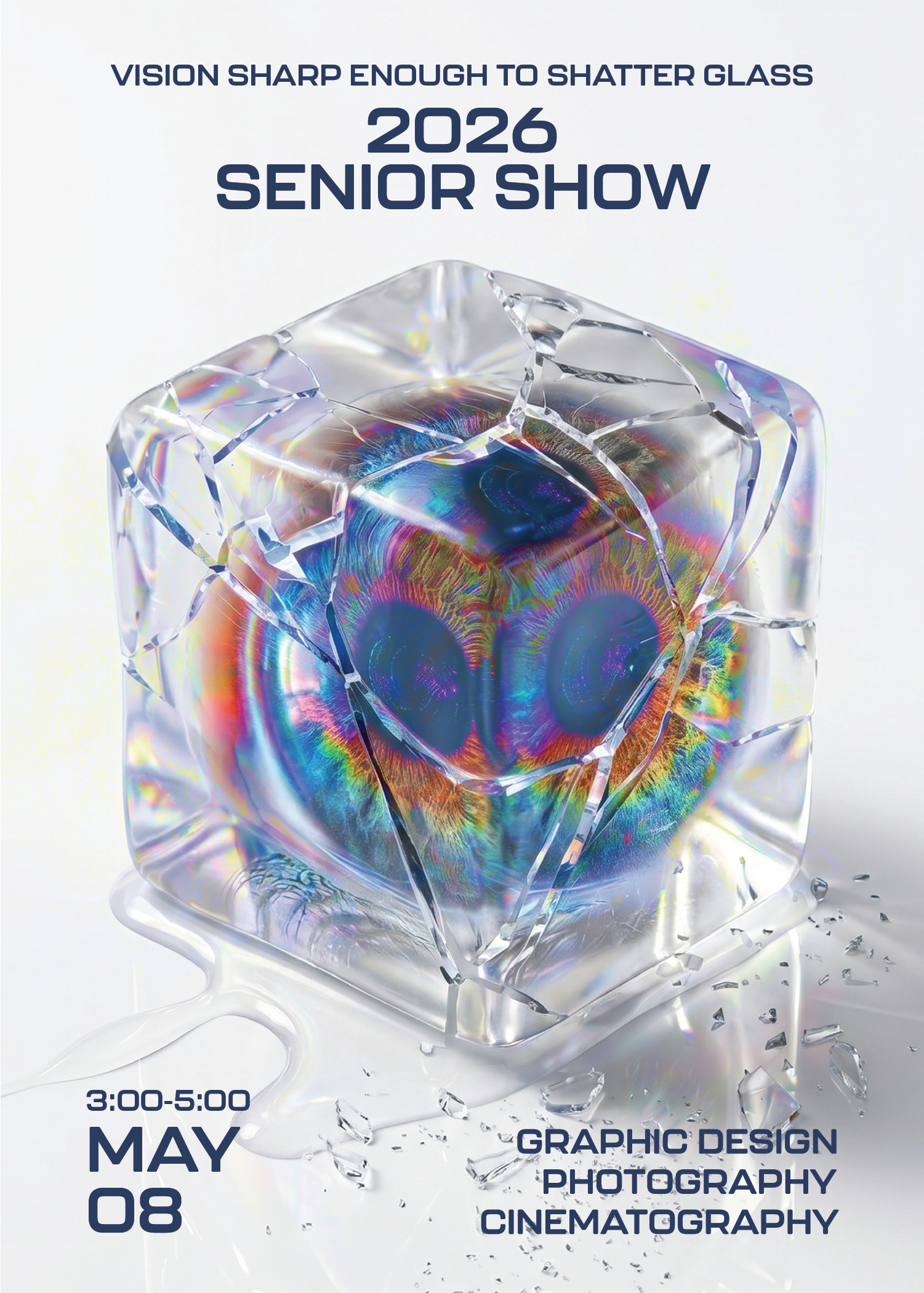
From there, the eye became the central visual metaphor. Rather than depicting an eye literally, I wanted to use it as a symbol of perspective, imagination, and creative potential.
The concept evolved around the familiar idea of “breaking the glass ceiling.” Instead of treating the phrase literally, I reimagined it through the visual of an eye breaking through a barrier. The result became a metaphor for creative vision pushing beyond limitations, expectations, and obstacles.
For emerging creatives entering an increasingly competitive industry shaped by AI and rapid technological change, the ability to see differently is itself a form of momentum. The poster positions vision as the force that moves us forward.
-
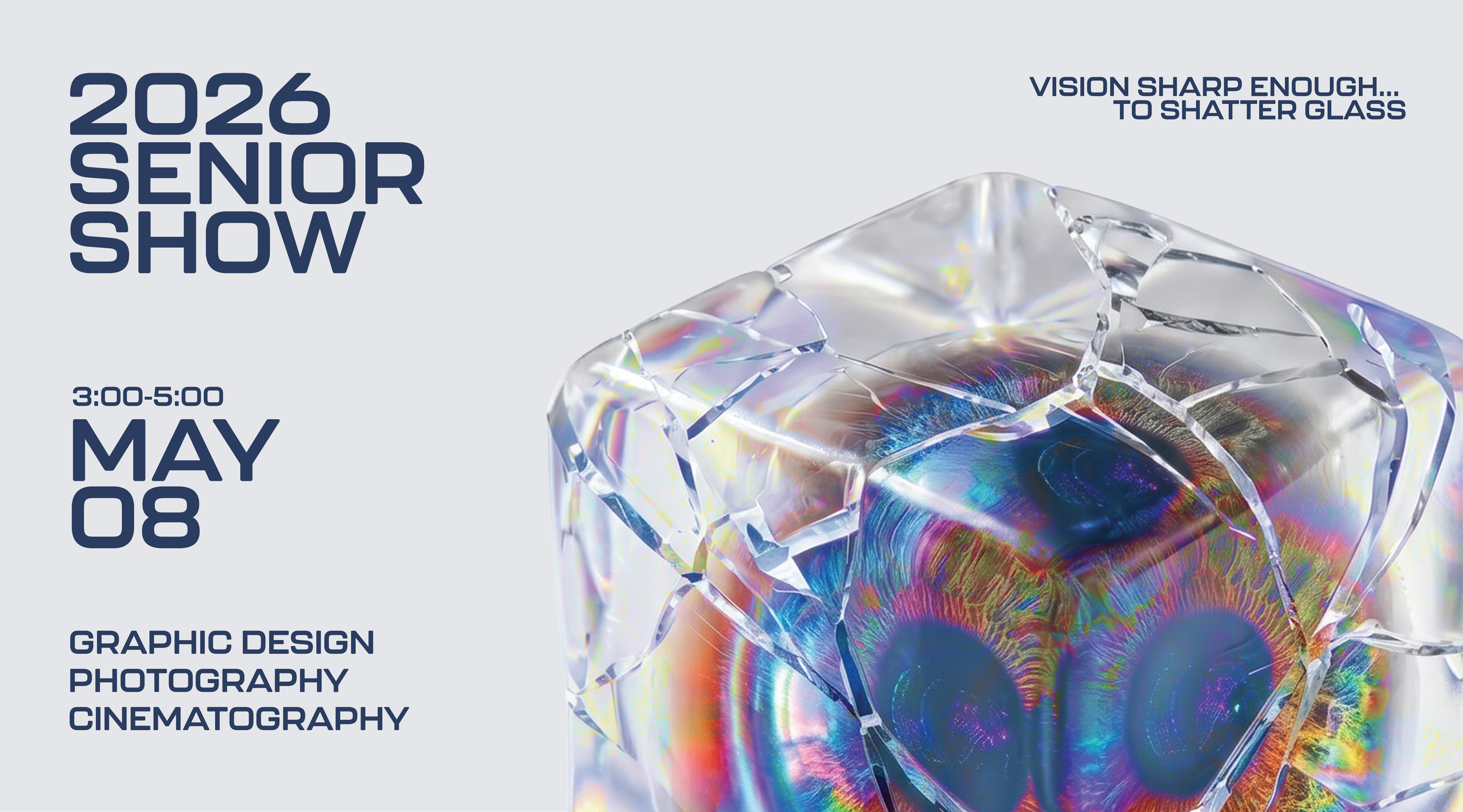
You can reach us anytime via our contact page or email. We aim to respond quickly—usually within one business day.The final composition features three eyes, each oriented at a different angle. Each eye represents one of the three disciplines in the Senior Show, while their distinct perspectives reinforce the individuality of each creative practice.
At the same time, the three eyes exist within the same enclosure and push against the same boundary. The composition reflects a larger idea: while each discipline offers its own way of seeing, the students behind them share the same department, community, and moment in time.
Different perspectives. One shared vision.
-
The visual was developed through a combination of AI-generated imagery and stock photography sourced from Pexels, which I composited, manipulated, and refined in Photoshop to create the final artwork.
Because the imagery is visually unexpected, hierarchy was especially important. The poster was structured around the essential information first, ensuring that the what and when of the event were immediately clear before allowing the viewer to explore the visual concept.
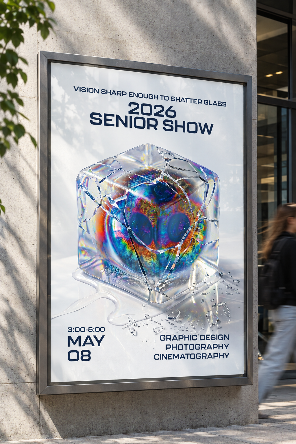
The final direction intentionally balances surreal imagery with a clean, information-driven layout. The goal was to create something that would stop people in their tracks, spark curiosity, and reveal more meaning the longer they looked at it.